
- May 9, 2017
- Customer Spotlight, Ecommerce, Vantage
7 Magento Websites We Love
There are lots of things that make an amazing website, and when it comes to online stores, Magento has a fantastic and easy-to-use ecommerce platform that can be customized and integrated with other functions. As such, there are tons of fantastic Magento sites out there, and we wanted to take a few minutes to pay homage to a few of our absolute favorites.
1. Made
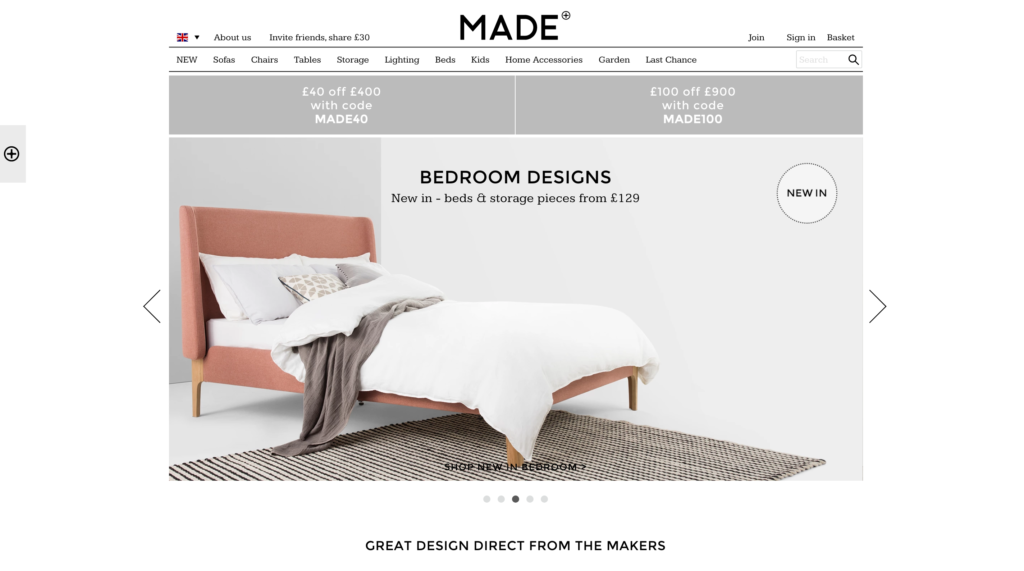
Made was created to connect consumers directly with furniture designers, without having to go through expensive distributors. The company is growing at a rate of about 40 percent per year, and they’ve expanded into several new countries since they first started. Here are a few of the things they’re doing right:
- Great images and product descriptions
- Easy to navigate
- Shopping by type, collection, and designer
- Provides stock quantities
- Easy to locate shipping and return policies
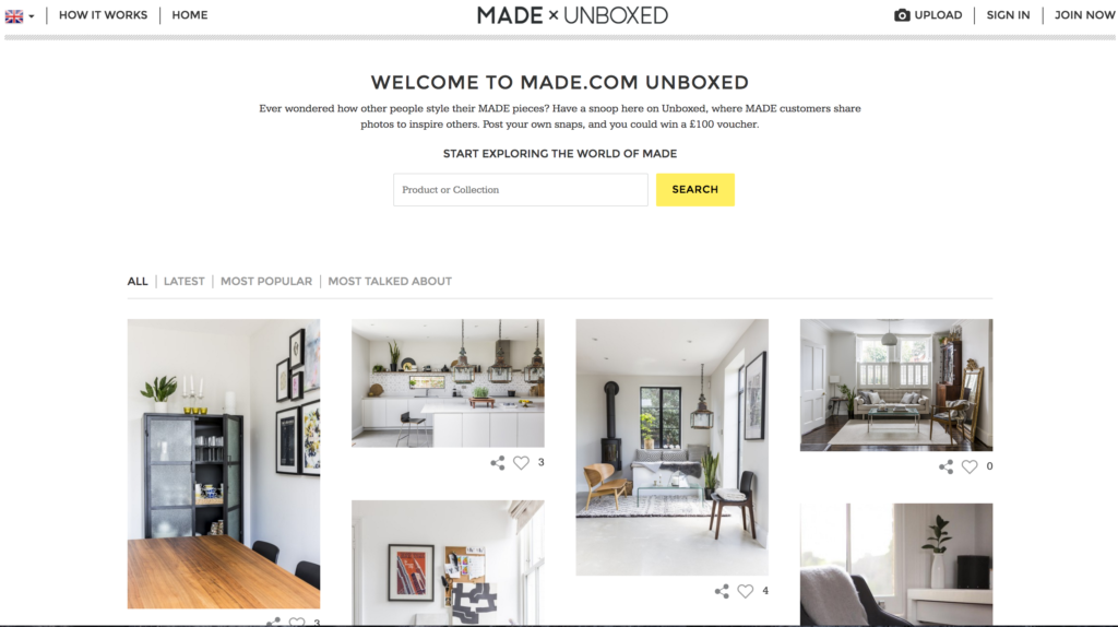
Another great trend that Made.com has capitalized on is showcasing how people have built, styled and designed their Made furniture through an Instagram inspired feed of the latest ‘unboxings’. You even have the option to filter by most recent, most popular or most talked about. This is a great feature because especially with furniture people often wonder how it actually looks set up in someone’s home instead of a showroom online.
2. Harvey Nichols
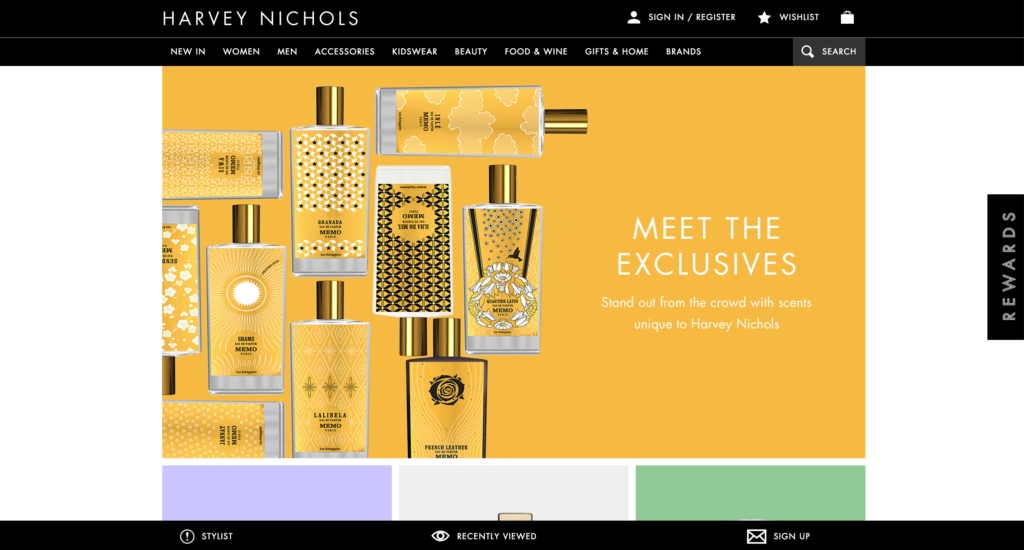
Harvey Nichols is an English department store that’s been around since the mid-1800s. One of the things we love most about this site is the mouse-over effect on the catalog pages: flat product images turn into model-worn garment images when you scroll over them, giving you a comprehensive idea of what the garment looks like. We also love that the delivery and return policy is listed on every product page, and the Shop the Shoot feature is a really cool idea. One especially standout notion is their tap at the bottom of the screen that prompts, “stylist”. From there you have a variety of customer service options, boasting, “Providing an exclusive, complimentary service, our Stylists offer expert guidance on product size and fit, as well as styling tips and trend inspiration. Get in touch to book an appointment instore now.” Plus – we love that you can view previously viewed items!

One especially standout notion is their tap at the bottom of the screen that prompts, “stylist”. From there you have a variety of customer service options, boasting, “Providing an exclusive, complimentary service, our Stylists offer expert guidance on product size and fit, as well as styling tips and trend inspiration. Get in touch to book an appointment instore now.” Plus – we love that you can view previously viewed items!
3. The Irish Store
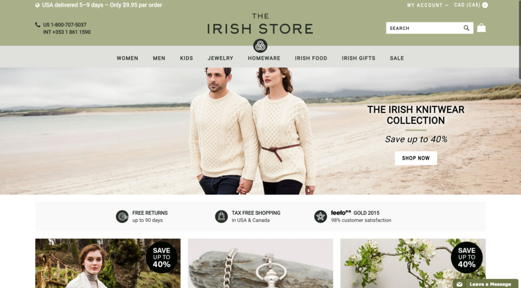
One of the first things you notice about the store is the authentic feel: from the color schemes to the photos to the fonts—everything about this store screams Ireland. But you also feel immediately welcomed with the shopping cart listed in local currency.
The Irish Store really nailed shopping for international customers. As a Canadian shopper, I immediately notice all of the following:
- Super affordable shipping cost and estimated delivery time
- Local and international phone number front and center on every page
- Tax Free Shopping in USA and Canada
- Free returns up to 90 days
All my questions answered at a glance! The Irish Store never lets you forget how easy it is to shop with them.
4. Paul Smith
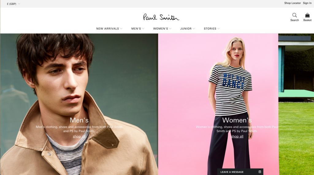
Paul Smith is a British fashion designer who has grown his enterprise to include 300 brick and mortar stores across the globe and a sleek ecommerce store to boot. We love the design of this website, including the balance, color, symmetry, and playfulness. The site is also functional and easy to navigate, and each product page has everything you need, from a wish list feature to a store finder to a sizing guide and care instructions.
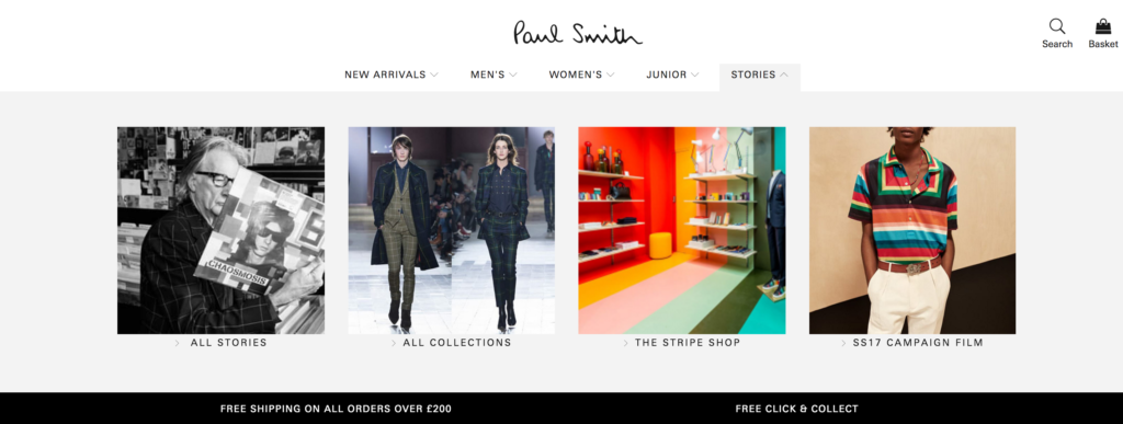
To keep things interesting for shoppers, they created a Stories section where they get a little more personal about their brand, ethos and general vibe they’re trying to convey. In this space we see their Stripe Shop showcased, a collaboration with ‘The Rug Company’ and other cool and relevant on-goings of Paul Smith.
5. Brewshop
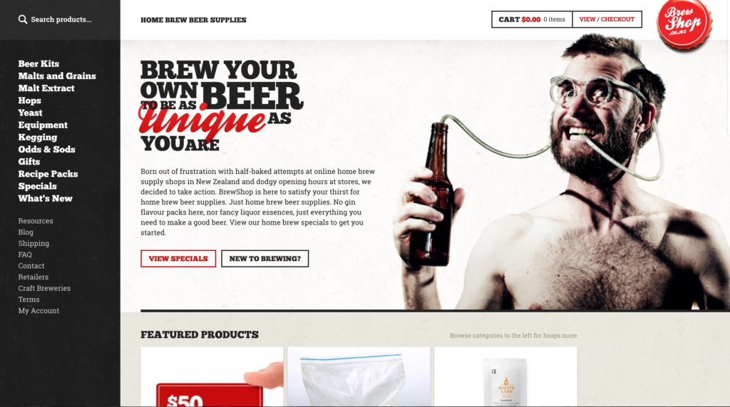
Nothing catches your attention like the Brewshop’s homepage pic, and they’ve done an excellent job of launching visitors right into their brand with a brief About bio right on the homepage. It’s clear they want customers to understand how the Brewshop came to be, and be bought into their brand.
Along with offering a great selection of all-things beer, Brewshop has also done a great job of cultivating authority, though carefully curated content. Brewshop has content tailored to customers new to brewing such as a Brewing Glossary, Starting Home Brewing, Brewing Methods, and more that will surely keep customers coming back.
6. Fred Perry
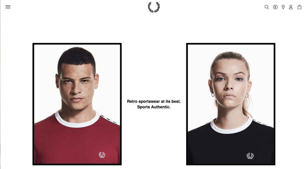
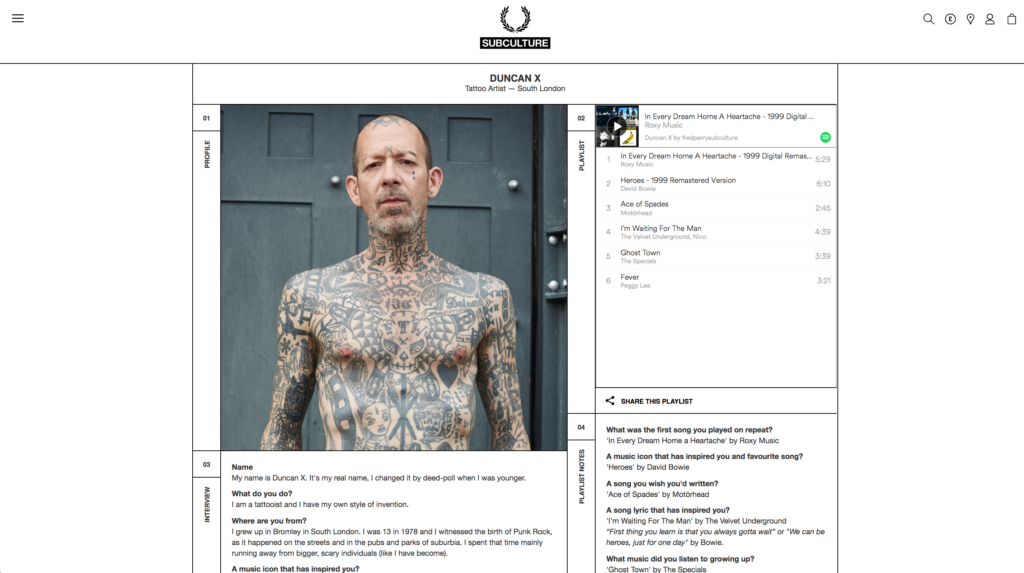
Fred Perry was a former pro tennis player turned fashion label namesake, and today the clothing brand is known for its mod and sporty fashions. Staying true to himself, the Fred Perry site keeps the sporting culture front and center. This site knows it’s audience and is very obvious about letting shoppers know whether the Fred Perry style is right for you.
As such the Subculture pages found on the site are right on brand, showcasing Fred Perry with the UK underground rather than the fashion elite. Their subculture page profiles some interesting people within the British subculture, news within the space, and provides you with a Spotify playlist alongside a few questions a la Seventeen magazine – except much more gritty.
Fred Perry understands fashion is more about creating and selling clothing; it’s about building a culture through which your clothing has meaning for the people sporting the designs.
7. Graze
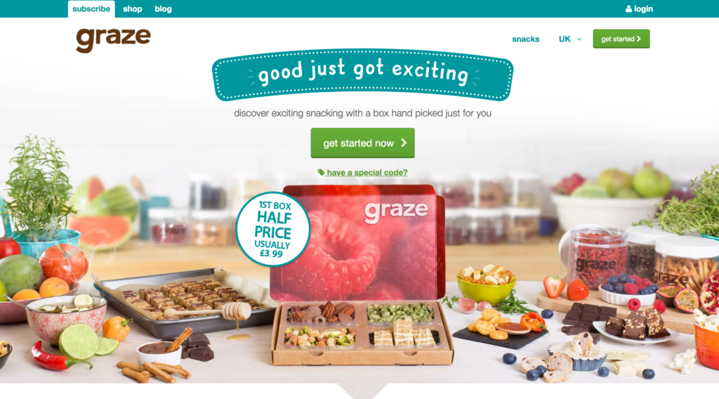
Graze has climbed their way to the top of the food chain to become the biggest healthy snack food brand in the world. The most enticing thing about this site is appetizing photos of tasty foods and yummy snacks. The Graze team has found a way to make healthy look just as appetizing as those chips you want, but should not make a habit of eating too often. When the company streamlined the site, simplified ecommerce operations, and made an easier checkout, they increased conversions by 429 percent.
Shoppers are made to immediately feel they are making the right choice by purchasing from Graze with nutritionist-approved badges and clear language on the health benefits of the food they sell. They have snack boxes that are under 150 calories, ones to boost your protein intake, and variety boxes for the adventurous snackers.
They have also gone above and beyond to build an active Grazers community across their social channels; engaging on a regular basis to ensure the brand stays top of mind and that customers are always satisfied.
There’s a theme with all these sites: they all focus on creating a strong presence, they prioritize their image, and they forge communities of like-minded people around the brand. There are plenty of best practices for running a functional Magento site, but these seven stand out because of their strong sense of identity, their commitment to brand distinctiveness, and their image-focused approached to ecommerce.


Leave a Reply
You must be logged in to post a comment.