6 Quick Tips to Creating High-Converting Facebook Ad Creative
If you advertise on Facebook, you know how important Facebook ad creative is to the performance of your campaigns. When managing your ad creative you must juggle different headlines, images, text and CTA options for different placements, across different devices.
What looks great for one will almost certainly not work for another. Fortunately, we have outlined 7 quick tips to creating high-converting ad creative that will make your life a lot easier (and not to mention, save you a bunch of money).
Here’s a cheat sheet to creating your own high-converting Facebook ad creative.
1. Keep Your Ad Copy Short
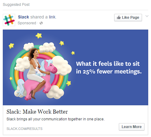
Think of how people use social media. Think of how you use social media. You likely don’t spend hours, scrolling through your feed and reading everything you see there. Instead, you probably scan your feed rapidly and only tap the things that catch your eye in a few seconds or less. You need Facebook ad creative that’s bold, eye-catching and engaging.
When it comes to creating Facebook ad copy, you’ve got to keep this tendency in mind. People want to scan your material, not devour it like a novel. As such, shorter copy is better than long.
Fast Company reports that the ideal length of a Facebook post is 40 characters (posts with fewer than 80 characters earn 66% more engagement than longer posts), and that headlines perform best when they’re approximately five words long. With that knowledge in mind, it’s key to keep your ad copy and Facebook ad creative short and sweet.
2. Give Your Audience Fewer Choices

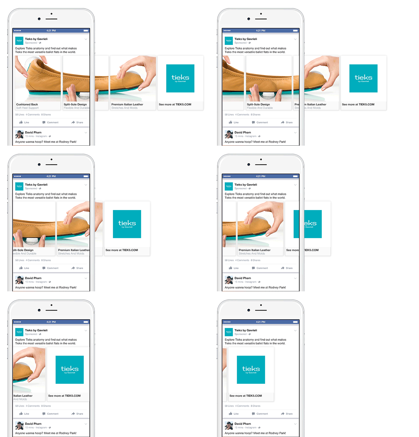
When it comes to your Facebook ad creative, it’s smart to give your audience as few product choices as possible. The reason for this is that ads with fewer products tend to outperform ads with many products.
If you’ve ever heard of “decision fatigue,” you know that extensive decision-making is stressful for the human brain and that people tend to shut down when faced with too many decision. That’s likely what’s at play when people confront ads with four different products and feel overwhelmed.
With this in mind, create unique ad copy for each of your featured products, rather than trying to cram them all into a single ad. Not only will your products get more individualized air time, but you’ll also be able to track which products are performing well, and which ads need a boost.
3. Keep Your Discounts in Dollars Rather Than Percentages
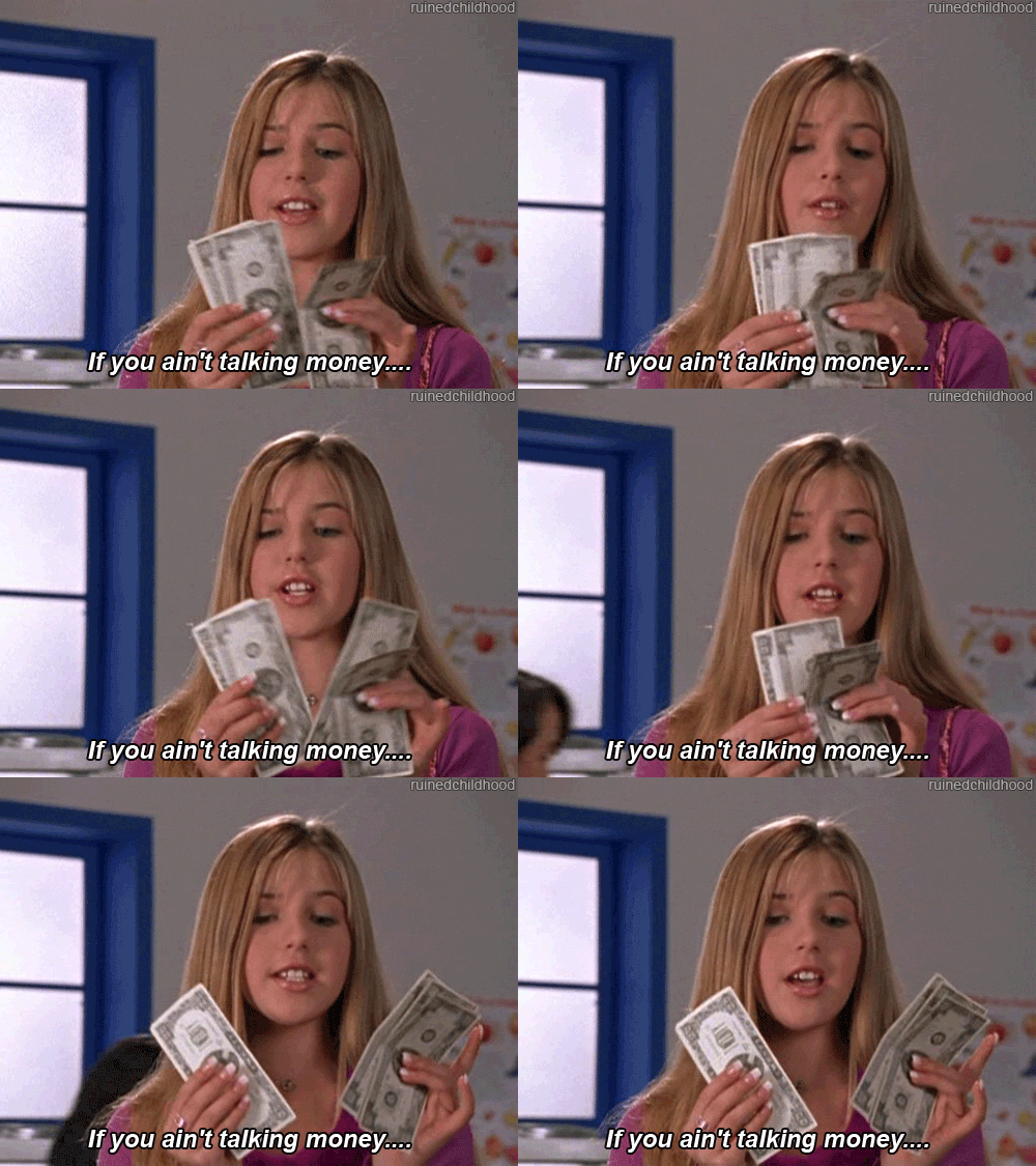
When it comes to discounts, your customers want to know exactly how much they’re saving. With this in mind, keep your stated discounts in dollars rather than percentages. For example, “$10 off a new sleep set” rather than “5% off our new sleep sets.” This streamlines the decision-making process for your customers and saves them from having to do the math in their heads – something we all appreciate. With Facebook ad creative it’s all about the dollar dollar bills upfront.
4. Add Text Overlay
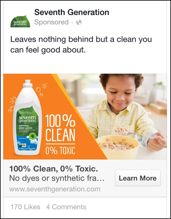
Did you know that Facebook ad creative with text overlay perform better than those without text overlay? With this in mind, hire a designer to add some overlay to your ads, or do it yourself with a free, easy to use program like Canva. Creative with a text overlay look more appealing and professional than creative without and really grabs the user’s attention.
5. Show Your Product in Action
Unless a viewer is already familiar with your product, they likely have some questions about how it looks and performs in the real world. Clear these questions up for them by showing your product in action. For example, if you’re selling a pillow, show people using that item as your customers would in real life.
Check out what Lululemon does with their Facebook ad creative:
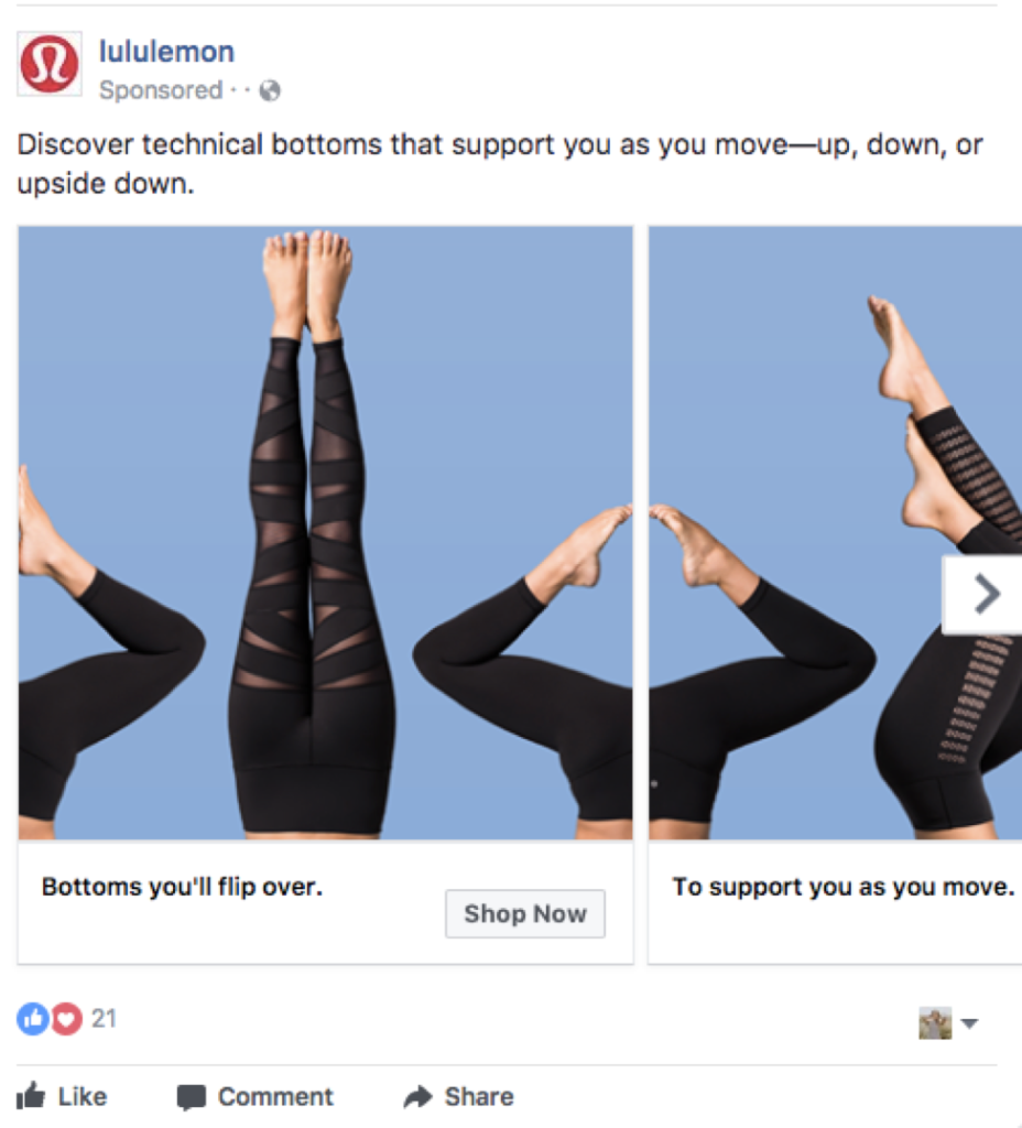
Not only does showing your product in life humanize your offerings, but it can also earn you more conversions by making it easy for your customers to visualize themselves interacting with your product.
6. Show Real, Live People
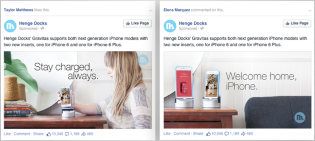
It’s unsurprising that people respond well to pictures of people. This is an important consideration when you’re putting together the images you intend to use for your ads. Consider instead of having a picture solely showing your necklace, have a person wearing the necklace – maybe even a few different ways if it’s versatile. Show them in a fun situation or whatever scenario you believe will be appealing to your target audience. Additionally, showing people wearing or using your product will showcase all the ways it can be used or worn. This way, people will be able to visualize themselves purchasing your product! Makes sense, right?
Bonus: A/B Test Your Creative A/B testing creative is a MUST when it comes to uncovering what ad creative converts into paying customers. You should be testing headlines, body copy, images and call to actions to find out what attracts shoppers to your brand. Take these 7 tips and start A/B testing your ads! There is no greater value for an ecommerce business than actually uncovering their audience’s interests, preferences, and personalities. For more information on the best practices for A/B testing Facebook ads, check out this blog!
Blow ‘Em Out of the Water with Dynamite Facebook Ads

The modern consumer is confronted with hundreds of ads each day, so what’s going to make yours stand out? When you master the art of creating beautiful, compelling ad creative that appeals to your target audience, it’s easier to claim those clicks, conversions, and opt-ins and promote ecommerce growth!


Leave a Reply
You must be logged in to post a comment.