- May 15, 2017
- Vantage
The Do’s and Don’ts of Ecommerce Product Pages
Many store owners spend time tweaking their homepage, but often forget about the importance of a well-designed product page. Choosing the best way to showcase your products to prospective buyers is essential, as it can make or break your shot at a sale. To help give you a nudge in the right direction, we’ve created a quick rundown of product page do’s and don’ts to give your business the boost it needs.
DO Use Vivid Product Descriptions
Product descriptions are vital in an ecommerce setting because customers cannot see the product for themselves. You have to be their eyes and ears, so to speak, so provide descriptions that are interesting, detailed, and use language that let customers understand and visualize exactly what you mean.
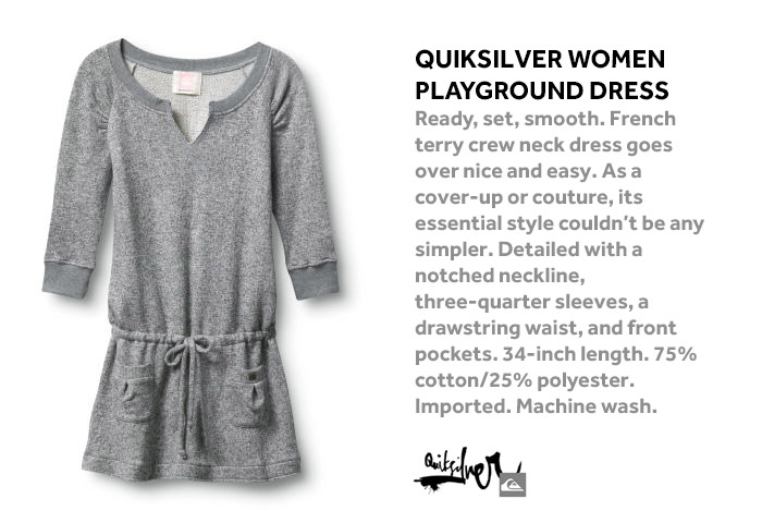
DO Pair Descriptions with High-Quality Images

Product descriptions and images go hand-in-hand, and many customers will read the description and then look to the photo to confirm what they read. Product images are essential for each product page, and these photos must be high-resolution, clear, and crisp. It’s also a good idea to have multiple views and to enable a zoom in function.
DO Increase Sales with Product Videos
Including videos on your ecommerce site can boost sales by up to 85 percent, and product pages are ideal places for these videos. Along with using your own unique and high-quality videos, you can also consider user-generated videos, which serve the double function of product video and testimonial.
DON’T Bury Your Call to Action
Your call to action is buried when it’s not apparent, obvious, easy to see, and easy to act on. Let’s look at a few examples to explore what makes a perfectly terrible CTA:
- Similar color to the background
- In the world’s teeniest font
- Long and wordy
- Uses flash, so it doesn’t show up on mobile devices
Instead, DO use a CTA that’s bold, optimized, simple, to the point, easy to read, and easy to act on. Like this: “Add to Cart”
DON’T Select Random Items for Recommendations

Cross-selling can be a hugely successful tactic, and when combined with upselling, it can account for up to 30 percent of your online revenue. But customers are so over the days of random and unrelated product suggestions. Online shoppers today want a personalized shopping experience.
Instead, DO use big data to target recommendations to the interests of specific customers.
An additional note: DO use upselling on product pages, and reserve cross-selling for the checkout pages.
DON’T Use Negative Social Proof
Remember all those times your parents asked you if you’d jump off a bridge because your friends were doing it? Well according to social proof, you probably would have. In fact, your parents were using an example of negative social proof, and it’s a terrible way to persuade someone not to do something. From a marketing perspective, negative social proof (“other customers have missed out; don’t be like them”) is a sure-fire way to reduce conversions.
Instead, DO use positive social proof, by saying something more like “50 percent of your neighbors have already tried this product.”
DO show other customers using the product, so prospective ones can see exactly how it will fit into their lives.
DON’T Use Social Sharing Buttons on Product Pages
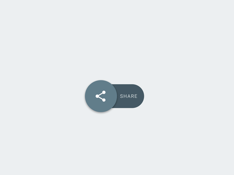
The Finnish hardware ecommerce store Taloon.com A/B tested their site with social sharing buttons on and off their product pages, and found that there was an 11.9 percent increase in conversions on pages where there were no social sharing buttons. Because of social proof. If none of your friends like it, chances are you won’t either.
Instead, DO put social sharing buttons on the sales confirmation page.
Ecommerce product pages are a minefield of do’s and don’ts, but by keeping these in mind, you’ll increase sales and conversions, and have more happy customers running around in the world. Key things to remember: great descriptions, high-quality images and videos, clear calls to action, personalized experiences, positive social proof, and keep the social sharing buttons off the product pages.

Get ecommerce insights, tips, and tricks delivered straight to your inbox!
By submitting your email above, you provide us consent to email you educational content, and information on our products and services. You may unsubscribe at any time.

Leave a Reply
You must be logged in to post a comment.